Rosetta Stone.

Anyone with any interest in language knows Rosetta Stone, the world’s best-selling commercial language education software for over twenty years. Using immersive learning as opposed to traditional grammar-based and translation methods, the software has been awarded educational and learning awards since its initial release and is widely considered to be the gold standard for language software.
Having originally distributed their language programs as box sets of CDs, Rosetta Stone met with nclud and described their desire to take their offerings to mobile platforms, with subscription-based online learning and relevant, engaging mobile experiences for a new generation of learners. We understood exactly what they were saying.
Strategy
Working with the Rosetta Stone team was a creative partnership.
We used an iterative and idea-driven process — brainstorms, napkin sketches, rough wireframes, paper prototypes — as a way to explore and validate the goals of the content and user experience requirements and the creative brief without getting bogged down too deep in design or building.
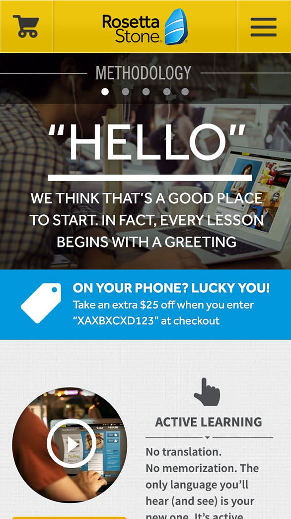
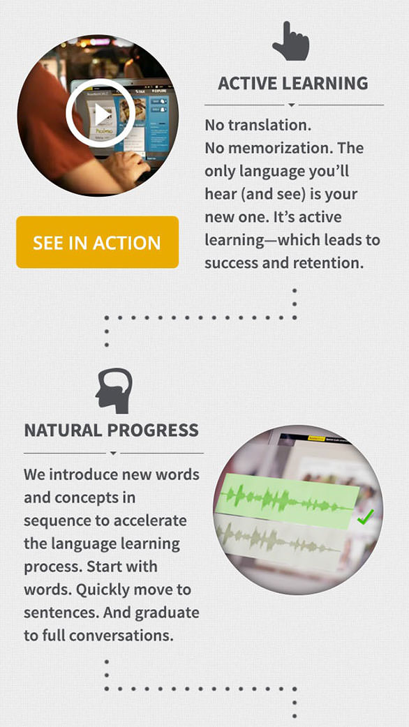
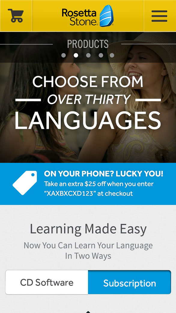
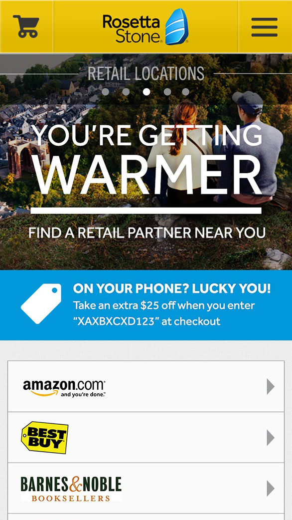
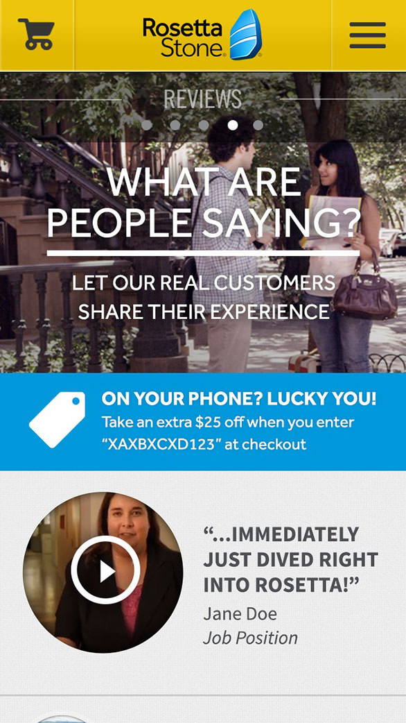
The strategy behind Rosetta Stone’s completely redesigned mobile site was to move away from the traditional “yellow box CD-ROM” that the company recently shed with a global rebrand, and instead showcase a future-looking, learn-anywhere software service. Thus, the initial site concept was built around the idea of using mobile interactions and gestures as an engagement feature, not simply as a way to navigate. Incorporating immersive images and videos allows the site to serve rich, interactive storytelling on the go (as well as act as a destination for those looking to purchase the software, of course).
After intensive market research, we broke down these features to simply target the two types of users visiting the site: the one wanting to learn more about the product on their phone and the potential buyer just trying to jump right in and make a purchase.

Design
nclud’s creative direction brought in the brand’s developing vibrant identity.
Using Rosetta Stone’s yellows, blues, and grays, as well as textures and patterns, the site clearly communicated that it was part of the Rosetta Stone family without overwhelming potential customers with the “yellow box.” By developing a system of large, bright hero images throughout the design, we crafted an emergent and emotional narrative for users to connect with as they browsed — and it encouraged them to delve deeper into the site. In this same vein, we opened the design up so it was less contained, allowing the information to flow easily and intuitively without boxing everything inside a tight grid.
Although the property was a mobile site, relying on a “tabbed” navigation scheme was dismissed as being too standard on native mobile applications. Instead, we designed an unobtrusive sticky menu at the top of the page that stayed with users throughout their scrolling and navigation to more easily provide access to rich additional content. With the goal of showcasing the products and their features and inspiring users to explore content, horizontal swiping within sections became a secondary form of navigation. Utilizing the full functionality of a touch device, users can simply swipe across a section or hero image to dive deeper into the content and interactions associated with it.

User Experience
The most critical piece of the new mobile experience was an intuitive shopping cart.
Naturally, the goal was to reduce time-to-checkout and make the entire process easy to navigate and complete. Through eye tracking, user testing, and in-depth interviews, we worked through these UX challenges.
The initial challenge was differentiating between Rosetta Stone’s CD software versus their digital offering and TOTALe (the online subscription service and app component). Illustrating the features and values from the start was crucial for the customer to understand what they were actually purchasing.
The next question that arose was: “do customers pick their language or their product first?” User testing showed that users often thought that different languages had different products, complicating the purchase. With that in mind, the checkout process was approached from a product-first perspective, having customers pick the product before choosing their language.
The final problem to solve was the labeling of the shopping cart itself. Through user research, we identified that using “Buy Now” microcopy as a call to action intimidated shoppers and made them think that they were skipping right to checkout, as opposed to simply adding it to their shopping cart. Simply changing that language to “Shop Now” encouraged customers to use the call to action, add products to their carts, and check out.

Development
We busted the usability myth that users don’t want the full content of a desktop site.
Users want to be able to have the full experience, just optimized for a mobile interface and data speeds. In development, our goal was to keep each page load smaller than one megabyte and have pages load in less than five seconds each. It was a stated business goal for cellular connections to still be able to easily and quickly explore the site. We also wanted to avoid replicating native functionality built into mobile browsers (as they tend to take up valuable screen real estate), so we didn’t try to fit “back” buttons into the design.
An interesting scenario arose when the mobile site was launching: the impending release of iOS 7. With its latest operating system upgrade, Apple implemented an edge-swipe gesture to mobile Safari that acted as a forward/back history navigation function. Although a consideration, we worked to keep the horizontal swiping in place by refining the interaction logic and doubling down on the functionality and usefulness of the top sticky navigation to ensure that all users were able to access and interact with the entire site.
Results
Upon launch, users immediately loved the redesign.
During live-testing and at launch, we could see right away that visitors were easily able to understand the teaching methodology and the difference in products even in the condensed space of the mobile format. The new mobile ecommerce experience launched in time for Black Friday, leading to a revenue per visit increase of 21% for the new site compared to the previous one — a staggering increase for the redesign and a conversion rate well above expectations for such transactions.
As the leading language learning company, we wanted a mobile site that would reflect our emphasis on innovation. nclud's passion for pushing what is possible on the web whilst keeping the needs of the user paramount perfectly aligned with our goals.
Albert Antiquera Creative Director, Rosetta Stone
Within Rosetta Stone, the launch of the new mobile website was highly anticipated. From the marketing team to senior executives, the entire company couldn’t wait to go live from the moment they first saw the new experience. In addition to the excitement about the new design, working together helped Rosetta Stone craft their overall mobile identity and how they portray themselves in the broader digital space. Reinvigorated by the site’s launch and successful reception, they are determined to provide their users the best possible site experience, no matter what platform they're using.
About Rosetta Stone
Rosetta Stone is dedicated to changing the way the world learns. The company's innovative, technology-driven language, literacy and brain-fitness solutions are used by millions of individuals and thousands of schools, businesses, and government organizations around the world.